
|
Analogue and Digital - first published on Photography<atters.com, march 2009
Any other shut-ins watch Midsomer Murders last night? (Picture of Innocence, screened on Prime, 7/3/09.) I admit the opening sequence of a Rolleiflex TLR being used, along with a Weston Master V meter and Invercone, hooked me in. The old bloke photographing a tree with said gear was annoyed when a rival photographer jumped in front of him brandishing a Nikon D2x digital SLR with a large flash attached. The shot of the tree was ruined and an argument ensued. The nameless town in the TV programme had two camera shops: one was full of film cameras, wooden tripods, packets of photographic paper, and had a darkroom in the cellar. A hand-written sign near the door read No Digital Cameras Sold Here. The other shop, Quik Pix, did not even sell film. Jack Sprat and his wife spring to mind. And, of course, there had to be a murder. The camera club doyen was garrotted with the braided strap of his own light meter. Ouch. It was the portrayal of film-using photographers as fuddy-duddies and digital photographers as a bunch of yobs that prompted me to write this post tonight, (while also trying to watch Top Gear). I imagine that feuds like that portrayed in Pictures of Innocence are going on in camera clubs all over Britain, New Zealand and elsewhere. It is also a debate in art circles, and in galleries that show photography. You will notice the title of this post is Analogue and Digital, not versus. In my view, there is not a competition or a feud of any kind; the two streams co-exist. I continue to slaver over fine prints produced in the darkroom by the likes of Laurence Aberhart, Mark Adams and Andrew Ross. But of course a print doesn’t achieve fineness by dint of coming from a darkroom. Less than a decade ago, most black & white prints were still made in the darkroom, with various levels of skill, and most were never intended or destined for the walls of a gallery; it was a simple, cheap way to print one’s work. (And it still is, although materials and chemicals are becoming somewhat harder to source. Somewhat ironically, the internet is a necessity if you still want to work in the darkroom.) No, fine printmaking is a craft, and, funnily enough, some of the same people who were making fine prints in the darkroom are now making fine prints digitally. It also holds that people who were crap in the darkroom are never really going to make good digital prints, because digital printing is also a craft. Dr Nick Bradford, a fine photograher based in Taupo, sent me a pigment print last week. I had asked him about making further darkroom prints as I have now sold most of the stock of his work. He said that while that was still possible, he had moved to using an Epson printer and Epson Traditional paper. I have to admit that the new Epson print had a lovely tonal range, near-enough identical to Nick’s earlier silver-gelatin darkroom print on fibre-based paper. The glossy surface and the sheer whiteness of the paper are qualities I have yet to adjust to, but I was impressed. http://www.northlight- images.co.uk/reviews/paper/epson_TPP_EFP.html for a review of the paper. Wellington photographer Julian Ward, a lifelong Leica shooter, has been printing digitally for some time, after investing in a Nikon film scanner to convert his 35mm negatives to digital files. He also shoots with a compact digital camera, more often now, apparently. Peter Black has recently dismantled his darkroom and replaced it with a ‘Lightroom’. Along with the Adobe software, he has been working with a top of the range Epson printer and Hannemulhe paper. He has also been photographing digitally. Having been frustrated in the past with wet-process colour printing, he now has full control of every aspect of his photographic quality; a greater degree of control than the darkroom ever allowed him, he says. When I first heard of his move to digital, I jokingly accused him of ‘going over to the dark side.’ He replied, ‘No, you’re on the dark side. I am on the light side.’ Photospace Gallery will show Peter Black’s latest colour digital work in April. The first digital inkjet prints shown at Photospace gallery were Leigh Mitchell-Anyon’s ‘Tiki Tour’ series, in May, 2002. http://www.photospace.co.nz/expo055.htm Admittedly these prints were not archival, with an estimated life of 30 years before noticeable colour shift. They were priced accordingly, with the option of purchasing a second print at a lesser price to keep in storage. I was very happy with the appearance of the images; the velvety blacks and over-saturated hues gave the photographs that extra degree of removal from reality, a hint at kitschness in keeping with their subject matter. ‘Night Sites’ in mid-2003 played upon the same qualities. http://www.photospace.co.nz/expo068.htm Yvonne Westra’s ‘Staged’ in September 2003 http://www.photospace.co.nz/expo068.htm was the first exhibition of archival pigment prints shown at Photospace. She used Quad-tone pigments on rag paper to print her surreal composite images. Yvonne has another exhibition at Photospace gallery in March, ’Magic Realism’ - http://www.photospace.co.nz/expo140.htm These exhibitions and others have sat alongside traditional analogue works for the last seven years, (and most of the colour works shown were digitally printed onto C-type photographic paper, even if captured on film). There is really no problem with it; no competition, no feuds, no yobs, no fuddy-duddies. At least not among the exhibitors. When it comes to selling prints to serious collectors of photography, there still seems to be a bit of resistance to pigment prints. Well, the problem is no longer one of longevity of the print. A properly processed silver-gelatin print will last a century at least, with adequate protection from the environment. In the digital world, the high quality papers now available from Iflord, Epson, Hannemulhe and other manufacturers are chemically highly stable and more than adequate in the archival department. So now are the pigment inks, black & white and colour. If you don’t believe me, check out the world authority in the field - Wilhelm Research: http://www.wilhelm-research.com/ The lasting quality of a colour inkjet print now far exceeds Cibachrome or any other type of wet-process photographic colour print. And the tonal quality of the inkjet-type print is now almost indistinguishable from a wet-process print. Though not inferior, the surface quality is the main point of difference, and that’s hard to pick when the print is framed under glass. The problem lies with the perception of how the photographic artist’s pigment print is made. It’s simple - everyone’s done one - you just get the photo into some sort of software, tweak it up a bit (a one-button process in the likes of Picasa) and hit the Print button. You could rattle off a hundred prints in no time. Wrong. For a start, good quality paper ranges up from about $15.00 per A3 sheet, and there’s inevitable wastage. The pigments are pricey, and even the printing machine will render itself obsolete after a few years (if you’re lucky), so will need replacing. Weighing that against a few dollars a sheet for darkroom paper and the decades of lifespan of the average enlarger, and that puts the cost of inkjet printing upwards of 5x more than darkroom printing. Time-wise, I’d say about the same, or maye a bit more for pigment printing. Once you get the hang of the darkroom, making good prints isn’t really that difficult, (although making great prints is still a talent confined to but a few individuals). Yet, making good quality prints using a computer and pigment printer still requires dedication, patience and a lot of research. Photographers can be heard discussing the merits of the various paper brands and types and the various new inks and printers with the same enthusiasm as they once did darkroom materials and processes. That’s not to mention the ongoing nightmare of screen calibration. When you decide to start to print digitally, you are stepping onto the bottom end of a long, steep learning curve; one that never ends, because of constant innovations hitting the market. Of course, once you have your software and printer profiles in place, your test prints made and your finished image file saved, there’s nothing to stop you hitting the Print button as many times as you can afford to. Except the market, of course; are there buyers for your 99 prints? Most photographers only make as many prints as will satisfy their immediate needs, and those will be the vintage prints. Later prints will still look different because of ever-evolving technology and materials, among other factors. I feel now, though, that there is a good case for photographers revisiting the idea of (small) limited editions in printing. This is because of the perception of lesser value of digital inkjet prints, compared to silver-gelatin prints, coming from potential buyers and collectors. It may now be preferable for photographers to declare limited editions in the range of 3 to 10, with no more than 1 or 2 Artist’s Proofs. This takes into consideration the size of the market for NZ fine art photographs. My position (and that of some other galleries) of preference for open editions with serial numbered and dated prints may have to take a back seat, at least for a few years or until the practise of digital print making beds down. Digital pigment prints on high quality paper will soon be the prevalent medium for exhibiting photography, so the photography buyers and galleries will have to adjust to it. From what I have learned from practitioners, there is as much skill, time and effort going into making fine pigment prints as there was with darkroom prints, and the production costs are significantly greater, so the pigment prints should have at least the same value. However, it is necessary to limit the print editions to ensure scarcity in order for the art market to adapt to and accept this change of medium and technique. by james | 8 March, 2009
0 Comments
Originally posted in PhotographyMatters.com in March 2010 The publicist for the upcoming World Cinema Showcase sent me a letter as a heads up about two films in the upcoming festival; one about Che Guevara – Chevolution, and Salt – a short film. Rather than describe them, I will leave you to look them up on their website, but please do. They sound interesting, and they’re showing in Christchurch, Wellington and Auckland. But the letter about “…several films that may be of interest to you and the photographic community…” set me thinking. I can never resist a film in which one of the main characters is a photographer, or that has photography as a theme. And there are quite a few. (I’m not talking about documentary films here, just dramatic films.) I’m not going to try to list or review all of them, but here are a few personal favourites, some obvious, some you may not have heard of (in no particular order): 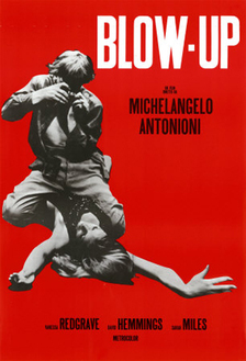 Blow Up, (1966, dir. Michaelangelo Antonioni) is a must see. It’s the film that popularised the figure of the streetwise, savvy fashion photographer, with its protagonist, Thomas (David Hemmings) loosely based on fashion photographer David Bailey. It set off a trend of photographers wearing white trousers and suede jackets. The film explores the predatory nature of photography/photographers, its sexual angles and fantasies; but more imortantly it is a study of the perception we have, individually and collectively, of reality. You are never sure whether the central event of the film, the witnessing of a murder, actually occurred; the photographer perhaps captured it on film, perhaps not. A key scene in this respect is the final one, involving the travelling mime troup. As a film-portrayal of London is the swinging sixties, Blow Up is superb. The scene in the nightclub with The Yardbirds playing is alone worth the DVD hire. The Hemmings character is an egoist, a bit of an arsehole really, but he is cool! In ‘On Photography’, Susan Sontag said this about Blow Up: And what exactly is the perverse aspect of picture taking? If professional photographers often have sexual fantasies when they are behind the camera, perhaps the perversion lies in the fact that these fantasies are both plausible and so inappropriate. In Blowup (1966), Antonioni has the fashion photographer hovering convulsively over Verushka’s body, with his camera clicking. Naughtiness indeed! In fact, using a camera is not a very good way aof getting at someone sexually. Between photographer and subject, there has to be distance. Sontag then refers to the movie Peeping Tom (1960) … about a psychopath who kills women with a weapon concealed in his camera, while photographing them. From memory, he used a tripod with a spike in one leg for a weapon, rather than the camera. Correct me if I’m wrong. Getting back to Blow Up, Hemmings was obviously well coached in using all the cameras, lights and enlargers. He handles everything like a pro. It always irritates me when I see in other films, for example, a camera with a manual winder being used, but the sound effect is a motor drive. Then they somehow take about 50 frames on a roll of film. If the director isn’t worried about that kind of detail, chances are the rest of the film will be crap too. Not the case with Blow Up at all. http://en.wikipedia.org/wiki/Blow_Up_(film) 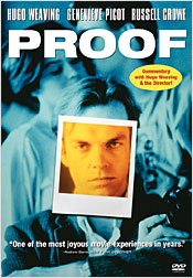 On the subject of photography interpreting reality, there’s the Australian film Proof (1991, dir. Jocelyn Moorhouse – not to be confused with the 2005 John Madden film of the same name), in which the blind character Martin (Hugo Weaving) takes photographs and gets his new friend Andy (Russell Crowe) to describe what the photographs show. This is his way of proving the world exists. But what if Crowe lies to him? This is an intriguing story, well worth hunting out. http://en.wikipedia.org/wiki/Proof_(1991_film)  High Art (1998, dir. Lisa Cholodenko) is another goodie. Syd (Rahda Mitchell) who works for an art magazine, Frames, discovers photographer Lucy Berliner (Ally Sheedy), who has gone to ground after being famous a decade earlier. The photography shown here is of the Nan Goldin school – photographs of friends and peers in an underground, hip lifestyle. 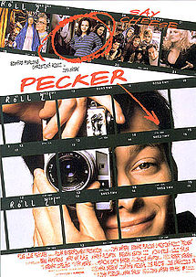 Another Nan Goldin connection here: Pecker (1998, dir. John Waters) amused me no end. If you’re a fan of the book “The Ballad of Sexual Dependency” by photographer Nan Goldin, you will totally get this film. Title character Pecker (Edward Furlong) incessently photographs his friends, neighbours, workmates and local eccentrics, and he stages an exhibition of his snaps in the diner he works at. A hip New York gallerist (Lili Taylor) happens along to the opening, ”discovers” Pecker and offers him a show in her up market gallery. What ensues is a warning about the ordinary being made famous; and it is a great comment on the fickleness and self-serving nature of the art world. Watch for the art photographer cameo at Pecker’s N.Y.C. exhibition opening (not mentioned in the Wikipedia article). http://en.wikipedia.org/wiki/Pecker_(film) 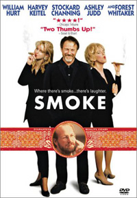 Another film set in New York, with the screenplay written by Paul Auster, is Smoke (dir. Wayne Wang & Paul Auster). While it doesn’t feature a lot of photography, photography is central. Augie (Harvey Keitel) obsessively takes a photo at 11am each day outside the tobacconist shop he owns. The camera is set on a tripod in exactly the same spot, pointing in the same direction. When the character played by William Hurt sits down and flicks through the albums containing decades of Augie’s photos, he says, “They’re all the same!” Augie then points out how each photo is different, but you see the same people cropping up over and over. Hurt then sees his dead wife in several photos, the event that kicks the plot into life. The concept of taking sequential photos in the way shown here may not be new, but it is brilliantlyand uniquely described in this film; and I have noticed a surprising number of people have since adopted the idea, some claiming it as their own. Aside from its photographic relevance, Smoke is a superb film. Anyway, I can think of a few others involving photojournalists in war-torn countries, and there’s that totally disappointing NZ film about the Burton Brothers, but enough for now. Your contributions and additions are most welcome.
by james | 29 March, 2009 In early 2008, Deb Sidelinger and I set up a blog called Photography Matters. It had its own URL and everything (www.photographymatters.com). One of the major beefs I had at the time was about the dissolution of the NZ Centre for Photography, a debacle that occurred behind closed doors. I sought to put the relevant information into the public arena, taking care not to libel anyone involved. In May, 2010, Photography Matters was hacked into oblivion; its content disppeared completely. I do not know if this was a deliberate act by someone local whom I pissed off or a random destructive act by someone overseas; but the lesson from it was back everything up.
I had made the mistake of writing posts straight into the Wordpress site, and its security at the time was not up to much, so I found. It'd been problematic to upload posts from Word docs so I just started writing straight into the blog site, and at that time there was no obvious (to me, anyway) way of backing up the site. I later received an email from someone looking for some of the old posts. He kindly said that it was some of the best writing on photography he'd seen online, which was a very flattering comment to receive. I have just used The Wayback Machine to relocate much of the written content of the Photography matters blog, although the photos are in most cases not preserved. If you want to read the old posts, they all under the Historic category. I am not going to repost the articles relating to the NZCP dissolution, though; that is all dead and buried. If you really want to research it, go to The Wayback Machine, search under PhotographyMatters.com, and look at the 2008 captures. All the best. |
AuthorPhotography Matters II Categories |
 RSS Feed
