
|
Peter Peryer Photographer - book review . Originally published on PhotographyMatters.com, September 2008
Peter Peryer Photographer, with essays by Peter Simpson and Peter Peryer, Auckland University Press 2008, printed by Printlink Ltd, Wellington. 136 pages, 80 plates. Many photographers I have met openly hate Peryer. Not personally, of course, but because of his success and status, which they feel is undeserved. But most art lovers who are not photographers think he’s wonderful. I’m a photographer but not a Peryer-hater; in fact I’m a fan. However, my knowledge of photographic practise gives me some sympathy with and understanding of these photographers’ views. So this review is going to be somewhat schizophrenic, speaking from two opposing viewpoints. I hope I can reconcile them. Many photographers, I feel, are sticklers; they tend to carry too much baggage, (technical, historical, conventional), and are hampered in their perception of photographic artworks because of it. However, their collective (and generalised) case against Peryer is a strong one and so needs to be expressed. (I haven’t yet encountered another reviewer bold enough to make this assertion, but someone has to. To review this book without saying it is to perpetuate the Emperor’s New Clothes syndrome, a thing that plagues much writing on photography in this country.) So here we go. In this publication, even the largest plates sit on the page with a generous border, so the photographs are not reproduced up to a size that severely exposes their faults. In Second Nature (City Gallery, Wellington, 1995), some photographs appeared as double page spreads and many of those were the ones that were technically flawed. (Plates 14, 15, 16, 37, 44 & 45 are the worst offenders.) Outside of photographers, the rest of the art world doesn’t seem to mind about this. If Peryer says it’s a good photo by including it in his oeuvre, then it is, end of story. Peter Peryer Photographer also suffers from these faults, and, although to a lesser degree, still significantly. As an illustration, imagine trying to enjoy a performance by a string quartet when the violinist keeps missing notes. Each time it happens, you cringe in pain. You look at the person sitting next to you who appears to be enjoying the interpretation and seems blissfully unaware of the wrong notes. He must be tone deaf, you think, so what’s he getting out of any of this? Further, does any Finn Brothers record contain a missed harmony, or are Elizabeth Knox’s novels peppered with spelling mistakes and bad punctuation? Conus, 2007 (Plate 19) is but one example of Peryer’s lack of care in his craft. The background is dirty and there is both camera shake and lack of depth of field, reducing the act of photography to the level of note taking. I can see the idea of the photograph but its technical flaws are just too irritating. In contrast, the cat toy photo, used on the book’s cover, which presents the same photographic challenges to create, is perfectly executed. (Could be the modern (digital?) camera deals with things more easily.) I could go on picking the flaws in other images in PPP but you will easily discern the offenders yourself. The most prevalent affliction is the flatness and dullness that comes from underexposure, which arises, predictably, in those light and subject situations where one has to understand how the camera’s metering system works in order to obtain a good exposure. I needn’t go further into explaining what is a common beginner’s mistake. Unfortunately, these and other problems in the execution of the photography will always distract from a discerning person’s enjoyment of the works. This has to be said. Fortunately, quite often Peryer gets the technical stuff right. Trout, (LakeTaupo), 1987 (Plate 71)absolutely sings. I have seen photographic prints of most of the selected monochrome works, and the book reproductions do them justice. My problem (and a lot of other peoples’) is that in the Peryer oeuvre, the misses are too often paraded as hits. Many photographs could easily and simply have been repeated and made better. The perception that those in the worlds of art and publishing don’t seem bothered by this leaves a lot of more technically competent photographers tasting sour grapes. Now I’ve got that issue out of the way, let’s look at the book itself, starting with the cover. Sarah Maxey, one of NZ’s top two of three book designers, has done it again here. The minimal, elegant cover design features a quirky, friendly colour photograph to lure the potential buyer. The back cover photo is a black and white image of a monarch butterfly, a lovely irony. The choice of typography for the title is surprising to the point of seeming inappropriate. I don’t know what the typeface is but it’s kind of flowery and feminine, with these qualities heightened by lifting the colours for each word from the photograph. The predictable typeface would’ve been a modernistic, masculine sans-serif in one colour, but Maxey is never predictable. The book as a whole looks and feels beautiful and satisfying. The design throughout is classic but contemporary, easy to read and respectful of the photographs. (It irritates me when less mature, more egotistical designers get hold of a photography book and use it as a showpiece for everything they can do. Maxey has never been guilty of that.) PPP is a respectable size for a photographer of Peryer’s importance and career stage, without being a tome. You can easily hold this book in your hands and sit back and enjoy it. The two essays are kept out of the way of the plates, and the titles under the photographs are readable but unobtrusive. I like this. The most annoying thing about the design of this book, something which is obviously necessary in keeping to a physical size and budget while presenting a useful number of photographs, is the pairing of the images on opposite pages. This is almost always difficult, a necessary evil. The problem lies in the way our brains work. When we are presented with two things side by side, we compare them and we find the similarities and differences. Intellectual comparisons follow, but it’s the visual ones that hit first and hardest. Usually these are facile (in a nice way), such as Punakaiki, 1997 and Owl, 2003 (plates 28 and 29). Here, the shape and patterning of one of the rocks echoes and reflects the head feathers of the owl. So, by creating that kind of visual pairing, which occurs from the first set of facing plates, the reader is set up to look for it on every page. With the pairing Farm Study, 1986 and Meccano Bus, 1984 (plates 14 and 15) the relationship is more subtle; it has to do with the size and angle of one of the sheep being the same as the bus, and reflecting the same rounded posterior—another echo pairing. The rural setting of both images (genuine for the sheep and constructed for the school bus model) is an example of an intellectual comparison. But given this setup, other pairings are a mystery, such as Isabella, 2001 and Trig (Rangitoto Island), 1993 (plates 42 and 43). This is what movie editors call a hard cut; there is no apparently graphical similarity between these two images; rather, they contrast and the effect is jarring. The running together of black and white and colour images, however, is not jarring; it is skilfully done. Once considered a no-no in book design, this tactic works well here. I guess the photographs were selected for the book on their individual merits, then put into sequence. It would be a difficult exercise to prove it, but I believe the sequencing could have been done better. Now here’s a bizarre comparison: Peryer’s photographs and the songs of The Ramones. If you don’t like the American punk bank, you might say they’re boring because all their songs sound the same. But, within a defined, recognisable style and some pretty tight self-imposed songwriting parameters, each song is distinctive and has something to say. Likewise, Peryer uses a limited range of formal devices and tends to select (rather, collect) subject matter that fits parameters and fields of interest he has defined for himself. One obvious subject category is The Tower (we’ll call it), mostly including man made structures, but also natural ones, here compared in Apple Tree, 2004 (plate 8) and Aerial, 2005 (plate 9). There are many other obvious examples. A common compositional device is to have The Thing come into the frame from the side or bottom, but not entirely, as in Sand Shark, 1991 (plate 30). These are two the more obvious features characterising and defining Peryer’s style, and it’s an interesting exercise to find others. This kind of analysis can have the effect of rendering Peryer’s photographic vision trite; another pylon-type structure, another animal half cut off by the frame; but it isn’t. His straightforward photographic technique and style works like many good things in that it makes the photography look easy. It’s like watching Martin Crowe bat for New Zealand. When he was in form, he seemed to have all the time in the world to play his shot, and each shot was so elegant, almost disrespectful to the bowler’s delivery. What makes photography so hard, though, is that it is so easy. (Anyone know who said that?) Especially these days. It comes down to knowing what to photograph. The How is good too, but should always be subservient to the What. If the best thing going for a photographer is his technique, the How, the result will almost always be images that are dead in the water. Peryer’s images are far from dead. He’s always been stronger on the What than the How, and the What is the hard bit. It is the simplicity of Peryer’s style of photographing that—when he gets it right—allows the act of photography to become almost transparent, putting just The Thing in front of us for our consideration. Because we don’t have to perform visual gymnastics to figure out what it is we are being shown (except where subject scale is an issue, a trick Peryer sometimes plays on us), there is more time to mentally spiral out from the idea of the image, to make our own associations and readings. Photographers who consider themselves superior to Peryer at executing images must consider that if they are being too visually complex, they can lead the viewer into a quagmire that, once escaped from, is immediately fled: once we’ve worked out what we’re actually looking at, we move on. The sophistication of Peryer’s photography lies in its apparent simplicity—we know What we are being shown, but now, Why?—and this is one of the reasons his images stay with us, reside in our subconscious and resonate, while others’ photos are not so well retained. Peter Peryer Photographer is a valuable book because it presents the last two decades of work by this important New Zealand artist. It is the first major publication to include Peryer’s colour photographs, and integrating them with his 1990s black and white images (as opposed to a chronological sequencing) shows the continuous nature, but also the subtle evolution, of his vision through the transition from monochrome to colour, analogue to digital. Indeed, allowing old and new technologies of image making to mingle does a nice job of breaking down the prejudices around each that people seem to be so tediously obsessed with at present. It is the image that is important, not how it was made. Having said that, the timing of this publication is interesting because of this analogue to digital transition, possibly making this book seminal. Other important photographers such as Peter Black have recently made a similar, revitalising transition, and Ans Westra has also been photographing in colour for some time (although she still rejects the digital camera). Peryer was one of the first to pick up on and embrace digital technology—full credit to him for it—which offers a greater degree of control for colour work than has been possible in analogue. I enjoyed his colour photographs in The Chelsea Project (1984), and I bought PPP mainly for the colour work. I wrote all of the above before reading the two essays, as I was more concerned with the visual and tactile nature of the book. Peryer’s autobiographical piece presents glimpses of life during the time he grew up and memories, all of which provides a context to understand his photography and his need to photograph. The essay leads nicely into the photographs. Peryer has a highly visual writing style which employs bite-sized paragraphs, each one leaving a distinct impression, like his photographs. His blog http://peryer.blogspot.com/ is a similarly interesting and entertaining read. Peter Simpson’s essay uses the concept of Peryerland as a gimmick to relieve its dryness. Nonetheless, picking up in time from where Peryer’s account leaves off, it is a useful history of his art career and it describes each of his publications and illustrates their covers. A three-page chronology follows the essay. Simpson’s thoroughly-researched contribution adds weight to the book, and is informative in tone. The more insightful content is the quoting from Peryer, well handled throughout. He does a good job of placing Peryer in the context and framework of New Zealand and international photography, and he mentions a large number of other important figures in the process. His readings of the photographs are a tad obvious and simplistic in many cases, and mostly revolve around the dual meanings and playfully deceptive appearances, in scale, material etc, of the subject matter. This is still useful content for anyone encountering Peryer’s work for the first time in PPP. The two essays, front and back in the book, balance each other nicely. I am pleased to see that Peter Peryer Photographer was printed in New Zealand. Printlink have done an excellent job, and they have developed into this country’s leading printer of high quality photographic books. It is far better to print here than to shave the budget by going to China, Italy or wherever, and it is by publishers using NZ printers that expertise and experience is built up here and retained. It is also prefeable from foreign exchange, employment and environmental perspectives. I recommend PPP either in hardback (limited to 100 copies, hand numbered and signed by both the Peters) or in softback for $50.00. I’m shelving my hardback at home and will get the softback for the gallery, because I know I’ll be pulling it out and discussing it many times with gallery visitors and our photography students, as I have with my copy of Second Nature is now looking very second hand. And just to readdress those who share my view on the the technical issues put forward earlier: get hold of PPP and read the photographer’s essay, then come at the photos again with a more open mind. Peryer has said that his photographs are all self portraits; that is, they are very personal and each reflect some aspect of the photographer’s self and life. Reading his essay helps one to know something about the Peryer’s life experience—you almost feel like you know the man by the end of it—and thereby the photographs are made more accessible, understandable, relevant and meaningful. Honestly, how can you hate the guy? by james | 21 September, 2008
0 Comments
Originally published on PhotographyMatters.com, September 2009
Unconscious Minds: a collaborative photographic exhibition by Massey University graduates. St James Theatre, Wellington until October 1st. This evening I attended the opening of this exhibition at the St James Theatre first floor gallery. I quite often feel underdressed at social events, but not usually at student exhibition openings. This one was the exception. The students were scrubbed up; the guys mostly wore jackets and ties and the girls seemed to be running an unofficial high heel competition. I walked around saying, “In my day we had our student exhibitions in a paper bag in the middle of the road…” The whole thing was impressive, but, importantly, the work was strong, well presented and well themed. The main theme, as outlined in the catalogue essay by Carly Sanders, is surrealism. She discusses photography’s relationship to and involvement with the surrealist movement in art with mention of the experimental and boundary-pushing work of Man Ray. The exhibition title Unconscious Minds nicely brings Freud into the theme, and many of the included photographic works evoke dreamscapes. The fifteen photographers have successfully created either digitally altered photographs or made clever use of ‘straight’ film-based photography to explore the exhibition’s themes. I only had a cursory look at each work at the opening so I’m not going to attempt to analyse individual photographs, but I can say that this exhibition is well worth attending. You’ll have to be quick though, as it only runs until 1st October. The first thing I did on arriving home was to pull out Susan Sontag’s ‘On Photography’ and find the essay on photography’s relationship with surrealism, ‘Solitary Objects.’ It is her conjecture that the photographers who were most closely associated with the surrealist movement, those who deliberately made ‘surrealist’ photographs, were in fact farthest from the mark, because photography is inherently a surrealist medium: all photographs are surrealist objects. “Surrealist manipulation or theatricalization of the real is unnecessary, if not actually redundant. Surrealism lies at the heart of the photographic enterprise, in the very creation of a duplicate world, of a reality in the second degree, narrower but more dramatic than the one perceived by natural vision. The less doctored, the less patently crafted, the more naïve—the more authoritative the photograph was likely to be.” Drag Sontag out and have a read. If you’re a photographer and you don’t own a copy, well that’s like being a Christian and not owning a Bible. Get thee to a bookshop! (Arty Bee’s used bookis a stone’s throw from the St James.) Anyway, although I agree with Sontag, I feel that this more deliberate exploration of the theme of surrealism and the unconscious, employing contemporary photographic practise, is legitimate and makes for an engaging exhibition. It would be of little value to exhibit (say) random family snapshots and claim them as surrealist objects (although my favourite work, Shaun Matthews’s ‘Circumstantial Happenstance’ comes close to this approach, being a set of four gridded panels made of thousands of almost random ’shoot from the hip’ photographs, or snapshots.) Also impressive is the way the course tutor and all the student photographers cooperated to curate and organise this exhibition. The significant array of sponsorship obtained provided the budget to raise the exhibition to a professional level and make it something all those involved are hopefully proud to be part of. by james | 25 September, 2009 Originally posted in PhotographyMatters.com in March 2010 The publicist for the upcoming World Cinema Showcase sent me a letter as a heads up about two films in the upcoming festival; one about Che Guevara – Chevolution, and Salt – a short film. Rather than describe them, I will leave you to look them up on their website, but please do. They sound interesting, and they’re showing in Christchurch, Wellington and Auckland. But the letter about “…several films that may be of interest to you and the photographic community…” set me thinking. I can never resist a film in which one of the main characters is a photographer, or that has photography as a theme. And there are quite a few. (I’m not talking about documentary films here, just dramatic films.) I’m not going to try to list or review all of them, but here are a few personal favourites, some obvious, some you may not have heard of (in no particular order): 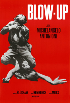 Blow Up, (1966, dir. Michaelangelo Antonioni) is a must see. It’s the film that popularised the figure of the streetwise, savvy fashion photographer, with its protagonist, Thomas (David Hemmings) loosely based on fashion photographer David Bailey. It set off a trend of photographers wearing white trousers and suede jackets. The film explores the predatory nature of photography/photographers, its sexual angles and fantasies; but more imortantly it is a study of the perception we have, individually and collectively, of reality. You are never sure whether the central event of the film, the witnessing of a murder, actually occurred; the photographer perhaps captured it on film, perhaps not. A key scene in this respect is the final one, involving the travelling mime troup. As a film-portrayal of London is the swinging sixties, Blow Up is superb. The scene in the nightclub with The Yardbirds playing is alone worth the DVD hire. The Hemmings character is an egoist, a bit of an arsehole really, but he is cool! In ‘On Photography’, Susan Sontag said this about Blow Up: And what exactly is the perverse aspect of picture taking? If professional photographers often have sexual fantasies when they are behind the camera, perhaps the perversion lies in the fact that these fantasies are both plausible and so inappropriate. In Blowup (1966), Antonioni has the fashion photographer hovering convulsively over Verushka’s body, with his camera clicking. Naughtiness indeed! In fact, using a camera is not a very good way aof getting at someone sexually. Between photographer and subject, there has to be distance. Sontag then refers to the movie Peeping Tom (1960) … about a psychopath who kills women with a weapon concealed in his camera, while photographing them. From memory, he used a tripod with a spike in one leg for a weapon, rather than the camera. Correct me if I’m wrong. Getting back to Blow Up, Hemmings was obviously well coached in using all the cameras, lights and enlargers. He handles everything like a pro. It always irritates me when I see in other films, for example, a camera with a manual winder being used, but the sound effect is a motor drive. Then they somehow take about 50 frames on a roll of film. If the director isn’t worried about that kind of detail, chances are the rest of the film will be crap too. Not the case with Blow Up at all. http://en.wikipedia.org/wiki/Blow_Up_(film) 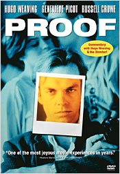 On the subject of photography interpreting reality, there’s the Australian film Proof (1991, dir. Jocelyn Moorhouse – not to be confused with the 2005 John Madden film of the same name), in which the blind character Martin (Hugo Weaving) takes photographs and gets his new friend Andy (Russell Crowe) to describe what the photographs show. This is his way of proving the world exists. But what if Crowe lies to him? This is an intriguing story, well worth hunting out. http://en.wikipedia.org/wiki/Proof_(1991_film)  High Art (1998, dir. Lisa Cholodenko) is another goodie. Syd (Rahda Mitchell) who works for an art magazine, Frames, discovers photographer Lucy Berliner (Ally Sheedy), who has gone to ground after being famous a decade earlier. The photography shown here is of the Nan Goldin school – photographs of friends and peers in an underground, hip lifestyle. 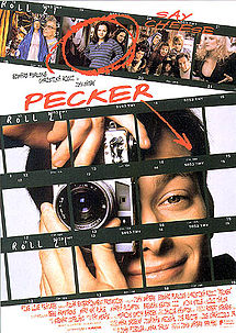 Another Nan Goldin connection here: Pecker (1998, dir. John Waters) amused me no end. If you’re a fan of the book “The Ballad of Sexual Dependency” by photographer Nan Goldin, you will totally get this film. Title character Pecker (Edward Furlong) incessently photographs his friends, neighbours, workmates and local eccentrics, and he stages an exhibition of his snaps in the diner he works at. A hip New York gallerist (Lili Taylor) happens along to the opening, ”discovers” Pecker and offers him a show in her up market gallery. What ensues is a warning about the ordinary being made famous; and it is a great comment on the fickleness and self-serving nature of the art world. Watch for the art photographer cameo at Pecker’s N.Y.C. exhibition opening (not mentioned in the Wikipedia article). http://en.wikipedia.org/wiki/Pecker_(film) 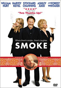 Another film set in New York, with the screenplay written by Paul Auster, is Smoke (dir. Wayne Wang & Paul Auster). While it doesn’t feature a lot of photography, photography is central. Augie (Harvey Keitel) obsessively takes a photo at 11am each day outside the tobacconist shop he owns. The camera is set on a tripod in exactly the same spot, pointing in the same direction. When the character played by William Hurt sits down and flicks through the albums containing decades of Augie’s photos, he says, “They’re all the same!” Augie then points out how each photo is different, but you see the same people cropping up over and over. Hurt then sees his dead wife in several photos, the event that kicks the plot into life. The concept of taking sequential photos in the way shown here may not be new, but it is brilliantlyand uniquely described in this film; and I have noticed a surprising number of people have since adopted the idea, some claiming it as their own. Aside from its photographic relevance, Smoke is a superb film. Anyway, I can think of a few others involving photojournalists in war-torn countries, and there’s that totally disappointing NZ film about the Burton Brothers, but enough for now. Your contributions and additions are most welcome.
by james | 29 March, 2009 |
AuthorPhotography Matters II Categories |
 RSS Feed
