
|
Photography as Public Art; the Courtenay Place Park inaugural light box photo exhibition, Flanerie and figments - published in PhotographyMatters.com in May, 2008 The precedent for this exhibition was at Waitangi Park on the Wellington waterfront when it opened in 2005. Tens of thousands enjoyed the outdoor exhibition of photographs by Yaan Arthus-Bertrand. Overhead shots of flocks of birds, herds of hippos or whatever seemed to conform to most peoples’ idea of exciting photography. (I guess these are the same people who flock to the international press photography award shows for similar reasons.) Risking sounding like a snob, the nature images bored me rigid. (This is possibly a result of excessive exposure to nature docos on telly in the 90s.) 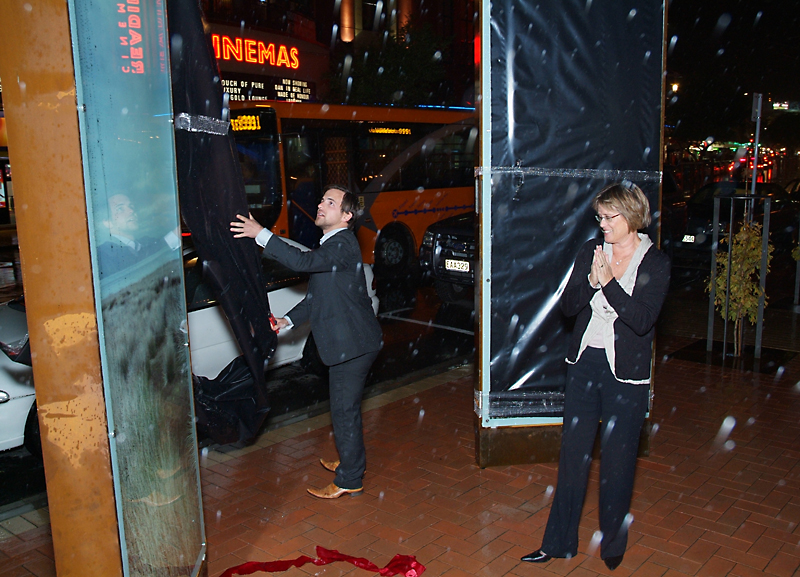 Mayor Kerry Prendergast and designer Simon Bush-King unveil the first light box photo, an image by Clare Noonan. Hmm… as I recall, the rain was falling downwards. The photos in the light boxes outside the St James Theatre, Courtenay Place, Wellington have the opposite effect on me: they are very engaging. There have been a number of proposals for the remodelling of this area over the last decade or so, but at last it has been done (except the old toilets…). This inaugural exhibition, Flanerie and figments, was curated by Andy Palmer, working with the park’s designer Simon Bush-King. Andy told me the photo selection was an 18 month project, requiring the approval of the Public Arts Panel. As Wellington mayor Kerry Prendergast said in her speech at the park opening last Friday evening, 2nd May, some of the images were not to her taste. And I have to say, as exhibition openings go, this was a goodie; very nice wine and food, a jazz band, no bouncers on the door or the kind of heavy-handedness experienced at City Gallery openings, (where one can feel like a schoolkid being herded around, forced to listen to interminable speeches by numerous sponsors before being allowed to touch the wine, etc (I can feel myself being plucked from the invitation list…)), and the speeches were kept concise. I would like to congratulate the Wellington City Council for their part in this project; for agreeing to put large scale photographs in the middle of town where thousands will see them daily, and for not butting in and censoring the images, even though they have expressed a level of disapproval. Public art should be controversial. No, it would’ve been much easier for the WCC to push for “professional” photographs, highlighting or celebrating some absolutely positive aspect of the city, perhaps making people feel more optimistic about the place, but being ultimately banal. Glad they saw sense and let the curator and designer do their work. Funnily enough, I was the only person at the opening with a proper camera (with the intention only of taking the images for this blog). There was no press photographer there, and no appointed WCC photographer that I could see. Could it be that with the possible controversy surrounding these selected images, the attention of the press was not sought? Normally an event like this would receive coverage, I would’ve thought. http://www.wellington.govt.nz/news/display-item.php?id=3198 for more info about Courtenay Place Park. 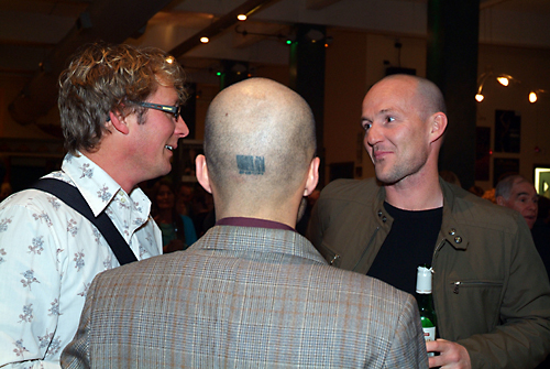 Curator/artist Andy Palmer, artists John Lake and Shaun Lawson, at the opening. As I said before, I find the work (mostly) engaging. It’s the sort of material you would see in a small, edgy gallery where it would then only find a few hundred viewers. Here, anyone passing on a bus gets a good view of at least eight of the sixteen 3m high images. And a healthy proportion of pedestrians are stopping to explore. As a bunch of photographs, these certainly challenge the viewer. My favourite is John Lake’s photo of a girl standing in a tree; one of those images that asks more questions than it answers. Palmer’s pale treescapes, panoramas disconcertingly rotated and set vertically, seem to predict the aging effects the other images may suffer in their six-month tenure. Shaun Lawson has set out to be controversial, with the box at the Mt Victoria end of the park housing his image of a grossly extended tongue; one of the photos that didn’t appeal to the mayor. His other image, from his Actress series, shows a young woman who has suffered a beating from her partner. (This image may soon be withdrawn and replaced by another in the same series.) I particularly enjoy Steve Rowe’s larger than life photos of money machines. At this totemic scale, they are at once deceptively real (I wonder how many people will bowl up in their cars to use them, or maybe try to tow them out) and objects of worship to the stuff that increasingly drives our society. Courtenay Place is the perfect location for them. Clare Noonan’s almost featureless coastal landscapes have a walk-in feel, and are confrontational in their abandonment of traditional, camera club-type compositional elements. I’m a fan. Amelia Handscomb’s images of the historic Thorndon house The Moorings (as photographed by Robin Morrison in the mid 1970s) gain in tension from being sited in the urban pastiche that in Courtenay Place, 2008. The architecture of the Reading Theatre opposite, with its neon signage, is a particular contrast. Others will find the images by Jessica Silk (a nude, via Gustav Klimt, no less) and Victoria Birkinshaw (a boxer) fascinating. The photographs are somewhat eclectic, but are all by photographers in their twenties or thirties, none of whom appear in the recent book Contemporary New Zealand Photographers; that is to say, this lot are not the usual suspects, but the up and comers, the real contemporary photographers. While, apparently, a few teething problems have arisen, getting things to look perfect first time round at this scale, backlit and in the open, and dealing with the elements—it pissed down for the unveiling—would be near impossible. The technical issues are now known and will be resolved, and the minor flaws do not affect my enjoyment of these images. I look forward to future exhibitions of photography in this great new venue. Go the Creative Capital. by james | 8 May, 2008 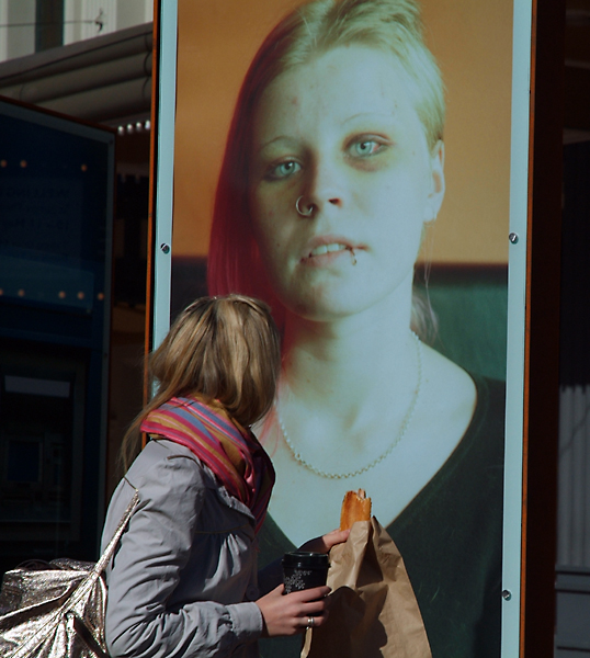 Viewing a photograph by Shaun Lawson - photo: Dominika Zielinska This photo by Shaun Lawson was later removed from the exhibition. Shaun's other photo was of a bovine tongue coming through a hole in something. Both images were chosen to challenge and perhaps perturb the viewer. It had that effect on our mayor. 7 Responses to “Photography as Public Art; the Courtenay Place Park inaugural light box photo exhibition, Flanerie and figments”
(I have removed the links below as they are mostly no longer not live.)
0 Comments
Analogue and Digital - first published on Photography<atters.com, march 2009
Any other shut-ins watch Midsomer Murders last night? (Picture of Innocence, screened on Prime, 7/3/09.) I admit the opening sequence of a Rolleiflex TLR being used, along with a Weston Master V meter and Invercone, hooked me in. The old bloke photographing a tree with said gear was annoyed when a rival photographer jumped in front of him brandishing a Nikon D2x digital SLR with a large flash attached. The shot of the tree was ruined and an argument ensued. The nameless town in the TV programme had two camera shops: one was full of film cameras, wooden tripods, packets of photographic paper, and had a darkroom in the cellar. A hand-written sign near the door read No Digital Cameras Sold Here. The other shop, Quik Pix, did not even sell film. Jack Sprat and his wife spring to mind. And, of course, there had to be a murder. The camera club doyen was garrotted with the braided strap of his own light meter. Ouch. It was the portrayal of film-using photographers as fuddy-duddies and digital photographers as a bunch of yobs that prompted me to write this post tonight, (while also trying to watch Top Gear). I imagine that feuds like that portrayed in Pictures of Innocence are going on in camera clubs all over Britain, New Zealand and elsewhere. It is also a debate in art circles, and in galleries that show photography. You will notice the title of this post is Analogue and Digital, not versus. In my view, there is not a competition or a feud of any kind; the two streams co-exist. I continue to slaver over fine prints produced in the darkroom by the likes of Laurence Aberhart, Mark Adams and Andrew Ross. But of course a print doesn’t achieve fineness by dint of coming from a darkroom. Less than a decade ago, most black & white prints were still made in the darkroom, with various levels of skill, and most were never intended or destined for the walls of a gallery; it was a simple, cheap way to print one’s work. (And it still is, although materials and chemicals are becoming somewhat harder to source. Somewhat ironically, the internet is a necessity if you still want to work in the darkroom.) No, fine printmaking is a craft, and, funnily enough, some of the same people who were making fine prints in the darkroom are now making fine prints digitally. It also holds that people who were crap in the darkroom are never really going to make good digital prints, because digital printing is also a craft. Dr Nick Bradford, a fine photograher based in Taupo, sent me a pigment print last week. I had asked him about making further darkroom prints as I have now sold most of the stock of his work. He said that while that was still possible, he had moved to using an Epson printer and Epson Traditional paper. I have to admit that the new Epson print had a lovely tonal range, near-enough identical to Nick’s earlier silver-gelatin darkroom print on fibre-based paper. The glossy surface and the sheer whiteness of the paper are qualities I have yet to adjust to, but I was impressed. http://www.northlight- images.co.uk/reviews/paper/epson_TPP_EFP.html for a review of the paper. Wellington photographer Julian Ward, a lifelong Leica shooter, has been printing digitally for some time, after investing in a Nikon film scanner to convert his 35mm negatives to digital files. He also shoots with a compact digital camera, more often now, apparently. Peter Black has recently dismantled his darkroom and replaced it with a ‘Lightroom’. Along with the Adobe software, he has been working with a top of the range Epson printer and Hannemulhe paper. He has also been photographing digitally. Having been frustrated in the past with wet-process colour printing, he now has full control of every aspect of his photographic quality; a greater degree of control than the darkroom ever allowed him, he says. When I first heard of his move to digital, I jokingly accused him of ‘going over to the dark side.’ He replied, ‘No, you’re on the dark side. I am on the light side.’ Photospace Gallery will show Peter Black’s latest colour digital work in April. The first digital inkjet prints shown at Photospace gallery were Leigh Mitchell-Anyon’s ‘Tiki Tour’ series, in May, 2002. http://www.photospace.co.nz/expo055.htm Admittedly these prints were not archival, with an estimated life of 30 years before noticeable colour shift. They were priced accordingly, with the option of purchasing a second print at a lesser price to keep in storage. I was very happy with the appearance of the images; the velvety blacks and over-saturated hues gave the photographs that extra degree of removal from reality, a hint at kitschness in keeping with their subject matter. ‘Night Sites’ in mid-2003 played upon the same qualities. http://www.photospace.co.nz/expo068.htm Yvonne Westra’s ‘Staged’ in September 2003 http://www.photospace.co.nz/expo068.htm was the first exhibition of archival pigment prints shown at Photospace. She used Quad-tone pigments on rag paper to print her surreal composite images. Yvonne has another exhibition at Photospace gallery in March, ’Magic Realism’ - http://www.photospace.co.nz/expo140.htm These exhibitions and others have sat alongside traditional analogue works for the last seven years, (and most of the colour works shown were digitally printed onto C-type photographic paper, even if captured on film). There is really no problem with it; no competition, no feuds, no yobs, no fuddy-duddies. At least not among the exhibitors. When it comes to selling prints to serious collectors of photography, there still seems to be a bit of resistance to pigment prints. Well, the problem is no longer one of longevity of the print. A properly processed silver-gelatin print will last a century at least, with adequate protection from the environment. In the digital world, the high quality papers now available from Iflord, Epson, Hannemulhe and other manufacturers are chemically highly stable and more than adequate in the archival department. So now are the pigment inks, black & white and colour. If you don’t believe me, check out the world authority in the field - Wilhelm Research: http://www.wilhelm-research.com/ The lasting quality of a colour inkjet print now far exceeds Cibachrome or any other type of wet-process photographic colour print. And the tonal quality of the inkjet-type print is now almost indistinguishable from a wet-process print. Though not inferior, the surface quality is the main point of difference, and that’s hard to pick when the print is framed under glass. The problem lies with the perception of how the photographic artist’s pigment print is made. It’s simple - everyone’s done one - you just get the photo into some sort of software, tweak it up a bit (a one-button process in the likes of Picasa) and hit the Print button. You could rattle off a hundred prints in no time. Wrong. For a start, good quality paper ranges up from about $15.00 per A3 sheet, and there’s inevitable wastage. The pigments are pricey, and even the printing machine will render itself obsolete after a few years (if you’re lucky), so will need replacing. Weighing that against a few dollars a sheet for darkroom paper and the decades of lifespan of the average enlarger, and that puts the cost of inkjet printing upwards of 5x more than darkroom printing. Time-wise, I’d say about the same, or maye a bit more for pigment printing. Once you get the hang of the darkroom, making good prints isn’t really that difficult, (although making great prints is still a talent confined to but a few individuals). Yet, making good quality prints using a computer and pigment printer still requires dedication, patience and a lot of research. Photographers can be heard discussing the merits of the various paper brands and types and the various new inks and printers with the same enthusiasm as they once did darkroom materials and processes. That’s not to mention the ongoing nightmare of screen calibration. When you decide to start to print digitally, you are stepping onto the bottom end of a long, steep learning curve; one that never ends, because of constant innovations hitting the market. Of course, once you have your software and printer profiles in place, your test prints made and your finished image file saved, there’s nothing to stop you hitting the Print button as many times as you can afford to. Except the market, of course; are there buyers for your 99 prints? Most photographers only make as many prints as will satisfy their immediate needs, and those will be the vintage prints. Later prints will still look different because of ever-evolving technology and materials, among other factors. I feel now, though, that there is a good case for photographers revisiting the idea of (small) limited editions in printing. This is because of the perception of lesser value of digital inkjet prints, compared to silver-gelatin prints, coming from potential buyers and collectors. It may now be preferable for photographers to declare limited editions in the range of 3 to 10, with no more than 1 or 2 Artist’s Proofs. This takes into consideration the size of the market for NZ fine art photographs. My position (and that of some other galleries) of preference for open editions with serial numbered and dated prints may have to take a back seat, at least for a few years or until the practise of digital print making beds down. Digital pigment prints on high quality paper will soon be the prevalent medium for exhibiting photography, so the photography buyers and galleries will have to adjust to it. From what I have learned from practitioners, there is as much skill, time and effort going into making fine pigment prints as there was with darkroom prints, and the production costs are significantly greater, so the pigment prints should have at least the same value. However, it is necessary to limit the print editions to ensure scarcity in order for the art market to adapt to and accept this change of medium and technique. by james | 8 March, 2009 Back from the Wilderness - originally posted in PhotographyMatters.com, February 2009. My apologies for not posting to this blogsite for a time. And I guess the last couple of postings were a little lame, judging by the lack of comments. My excuse is I have been preoccupied with Paranormal Investigation lately. You may have seen the coverage in the Herald’s Canvas magazine supplement, among other things in the press, and I’ve been diddling with the website (using old-school html, version 0.5 or something) www.strange-occurrences.com The other reason for the lack of postings is that, frankly, things in the photography world have been a little dull lately. Nothing has got me fired up. OK, there are great new products around, but there are plenty of other forums and websites about the latest technological offerings and their pros and cons. No, I just haven’t found anything to get my teeth into. Having said that, I’m still a little steamed at the demise of the NZCP. Their collection of photographs and other photography-related items is in the process of being deacquisitioned; that is, being picked over by others. It’s probably for the best, because although the collection is being broken up, its better part will be rehoused in public collections with storage facilities and public and internet access that are better than the NZCP ever had. What continues to irk me is that all this has been done behind closed doors; there has been no information circulated by the board of trustees to the subscribership of the NZCP, many of whom have been long-term financial supporters and some of whom have even donated valuable items to said collection. What a shambles! So I am now going to resort to reviewing an exhibition currently showing in a gallery I own and half-run (not Photospace). It’s an installation that, among other things, seems to be about photography. It’s only on till March 3rd, so not many people will get to see it. And some of those who have seem completely mystified, walking out wondering if it’s an exhibition at all and not just something halfway through being installed. The review follows in the next posting - maybe tonight (but there’s some good telly on) or maybe tomorrow. [See below] Current recommendation: Peter McLeavey is showing an exhibiton of photographs by Laurence Aberhart. Although being a long-time fan, I have sometimes found Aberhart’s photographic approach a little dry. However, McLeavey’s selections of his work are always enjoyable and lively, and this exhibition perhaps shows a loosening of approach, a more humanistic view. I wonder if there has been a little reverse-influence on the master by the acolyte (you know who I mean). I only saw the work during the opening and so will have to revisit when the gallery is quieter. P.O.A. Collective Installation at GMG
The P.O.A. Collective are: F. Emera, R. Chival, Sue Denholm. Soundtrack by Wellington Analogue Noise Kollective. The installation “Divided by Zero” is at Gilberd Marriott Gallery, 37 Courtenay Place, Wellington, until March 3rd, 2009. www.gilberdmarriottgallery.com for gallery info, and http://www.photospace.co.nz/_gmg_pages/poa/POA-installation_photos.htm for installation photos. I have lifted a few of them for this review. I understand the title of the exhibition is drawn from its soundtrack. Mathematicians know that dividing by zero is more than an error; it makes no sense whatsoever. So when you place an antique Hewlett Packard calculator atop a detuned radio and instruct it to divide by zero (zero, enter, divide in Reverse Polish Notation) it gives an error signal, a flashing zero, which interferes with the radio signal in an annoying, obtrusive rhythm. Fuzzed out, this forms the background of the first half of the ambient soundtrack. Other devices employed, I am told, include lowering the recording device (ironically, a digital voice recorder) into a cannon shell (”Shellcase”) and raising it out again. These guys sound like performance artists. I for one would be intrigued to see a performance by W.A.N.K. in the gallery installation, but it has proved impossible to arrange. The installation itself is somewhat hard to pin down, as it seems to be concerned with two seperate issues: the demise of conventional photographic practise and the sacrosanct but temporary nature of the exhibition space itself, in general. Let’s deal with the latter aspect first. The blue screen (actually a photographer’s paper background roll supported by a pair of studio poles) seems to await some non-existent video projection. It is cordoned off by an arc of cheap plastic chairs in such a way that if you want to be seated (to view what?) you must move one of the chairs. But the chairs are supposedly part of the artwork, so one should not touch. Also, placed neatly on the chairs are the exhibition catalogue sheets. Help yourslef to one? No: each sheet is signed S.D. and edition-numbered. Are they then for sale? It appears, on a second visit, that people have absconded with some of them. Does this rate as an art theft? Also apparently a part of the installation, flanking the blue screen and propped on more plastic chairs, are a couple of coreflute signs saying No Throughfare. Don’t they mean No Thoroughfare? I’m sure I saw signs like these around Courtenay Place during the recent carnival, and they don’t appear in the photo above, so perhaps they are a recent addition; a testament to the illiterate nature of signwriters or just a couple of patches of yellow to contrast with the large area of blue? Either way, they declare at least a part of the gallery room Off Limits. Rules of engagement? Disengagement? Now we get to the more obvious photographic theme. This box, previously a light-tight container for silver-gelatin black & white photographic paper, appears to have been used, several times, to freight precious, finished photographs from photographer to gallery. It probably once belonged to eminent photographer Mark Adams, and has travelled through McNamara Gallery, one of NZ’s two specialist photographic galleries, and most recently contained photos by Andrew Ross. It has now been signed by Sue Denholm (Anyone get the pun? Each member of this collective seems to have a pun for a name!) and hung in a gallery, so does that make it a piece of art in its own right? The same question could be asked of the almost-empty bottle of developer, signed by F. Emera and placed on a plinth with a couple of spotlights shining down on it. The Geoff Sparrow Camera Repairs sign carries no signature; the contribution of the even-more-mysterious third member of the P.O.A. Collective, R. Chival, perhaps? Geoff Sparrow is a repairer of mechanical-type cameras and is recently retired; much like the things he worked on. With the move by many photographers towards the latest digital cameras and printing materials, this small collection of relics from the age of the darkroom takes on the significance of a museum collection. It reminds me of the stuffed birds you used to see at the National Museum on Buckle Street, Wellington; the moa, the huia and other recent extinctions. (Ilford clings on like the notornis while century-old Agfa went kaput two years or so ago.) A less-noticeable part of the installation are the pencil marks on the wall pointing out nail holes from the previous exhibition that need to be filled and painted over (before the next ‘real’ exhibition?) and the can of paint and other decorating tools lying or hanging about. Something to do with the temporary nature of a gallery exhibition, perhaps? Each exhibition is written over, erased like videotape, by its successor. So are works of art in a gallery really ephemera, or need they be archival in order to be saleable, collectible, to spend the rest of their lives in some private or public collection; or to endure a century in the dark recesses of a basement storeroom, awaiting future art-archaeologists. “Who the hell would sign an old plastic bottle?” they may well ask. It might be that he most telling aspect of this installation is the acronym of the creators of the soundtrack: Wellington Analogue Noise Kollective. by james | 28 February, 2009 |
AuthorPhotography Matters II Categories |
 RSS Feed
