
|
Photoshopping in the 1940s - Palmerston North to North Africa - originally posted in PhotographyMatters.com, October 2008. 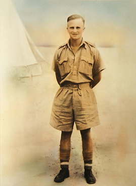 This is a photograph of my uncle Douglas Ralph Gilberd (known as Ralph), my father’s brother, who was killed in action in August 1942 at the battle of El Alamein. I believe he succumbed to gangrene after being severly injured by a land mine. Unfortunately, antibiotics were not available in time, but they were in use shortly afterwards. This photograph had been around the house for a long time, and I unearthed it to take to a family reunion we had over Labour weekend. I admit, it had me fooled. I thought it had been taken in the North African desert. 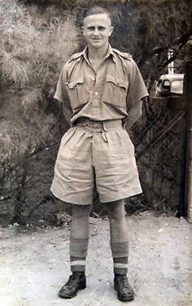 But my observant wife, Denise, noticed this photo (below) in another family member’s collection. It looks to have been taken in the front garden of my grandparents’ Palmerston North home when Ralph was on leave. Someone may be able to enlighten us as to how the result above was achieved, but I would guess that an enlargement was made from the snapshot negative, then clear cut with a scalpel blade, rephotographed, and the made-up desert background hand-painted in. The fake looks obvious in hindsight, but if you’re not looking for something (Ralph was in the desert, after all, and vignetting a genuine background to declutter a photo was common practise) you tend not to find it. I wonder if this level of falsification was usual for photographic studios. It may have been something they advertised as a service, or else it was done on special request. It is understandable that my grandparents would want the photo to appear this way, especially after having lost a son.
A lot of alteration of family photos goes on these days, with the most common request being to remove some person who has fallen out of favour. I used to advertise on the Photospace studio website that photos can be digitally restored and retouched, but repeated requests to alter photographs made me uncomfortable. The last straw was somebody asking, “And while you’re on the job, could you straighten her mouth? It’s always bothered me that she had a crooked mouth.” While these things are usually done in all innocence, they can end up being misleading to later generations who are trying to establish historical information by looking at photographs. A detail such as a mouth being straightened could lead to a mis-identification, for instance. Manipulation of photographs, whether by using computer software or old school methods, is not just an ethical issue for photojournalists and publishers, but for anyone who alters the content of any photograph. This posting has got a little heavier in tone than I intended, after laughing at myself for being duped by such a low-tech trick. I’ve read so much discussion and seen so many examples of unethical photo manipulation, but this is the first time I’ve directly encountered it, trivial as the example may be. by james | 28 October, 2008
0 Comments
The Dominion Post Axes Visual Arts Reviewer - originally posted on PhotographyMatters.com, October 2008.
Mark Amery’s Wednesday art review has just been cancelled by the Dominion Post. This leaves the major metropolitan newspaper in New Zealand’s ‘creative capital’ with no visual arts reviewer! I believe this will make the Dom Post unique in this regard, with all of the other metro papers running a healthy level of art criticism. How embarrassing for them. While The Dominion Post continues to cover the visual arts with informative promotional pieces—and I’m not knocking this practise, especially as Photospace Gallery and some of its exhibiting artists have benefited significantly from the publicity—the loss of Amery’s column will leave a serious gap. As I mentioned in an introductory posting on this blog, the thing that is weakest in the triangle of artist-gallery-critic is the criticism. Artists need critics in order to give them objective, external feedback on their work, and the viewing public need critics to help them develop their personal opinions, tastes and insights into current exhibitions. With the recent demise of the NZ Journal of Photography, there is now a severe shortage of publishing outlets for criticism of photographic art, particularly in Wellington. To clarify, galleries and artists send press releases to newspaper arts editors, who then sometimes decide to give editorial coverage. This usually involves a reporter interviewing the artist (and sometimes the gallery director or curator) and a photographer. It’s all great for publicising the show but it’s different to what a critic does. A critic will visit the exhibition, usually unannounced, look at the work, make some notes, do some research and come up with a piece of writing that is a mix of description, evaluation and personal opinion. This is done without input from the gallery or the artist. In my experience with Photospace gallery, there has been a high level of publicity-type journalism published, some it by the Dom Post, and it has all been much appreciated. Most of the exhibitions have enjoyed some degree of editorial coverage. Reviews, on the other hand, have been few and far between. A couple per year seems to be about it, unfortunately, and I don’t think many other private galleries have fared better. Being an art critic in a country the size of NZ is, of course, fraught with hazards, the main one being that everyone knows everyone else. In the days of punk and new wave, (I hated that term) it was not unknown for a journalist to get the snot kicked out of him by fans of the band, or the band itself, for writing a bad review of a gig or record. I haven’t heard of anything like this lately, but having an opinion and publishing it can still make one unpopular. Mark Amery always wrote fairly, with balance and insight, and I don’t believe he could have seriously offended anyone. But he wasn’t afraid to give an opinion, to say what he thought. Reading Amery’s column, you always knew you’d read a review. Some other reviewers (I could name names…) seem to be able to waffle for 500 or 1000 words without actually saying anything. You end up confused as to what they actually think because they’re too wimpy to offer much more than mere description. Amery also avoided the tedium of academic-style writing, choosing not to use his column to showcase his vocabulary or a collection of post-modern catch phrases. Mark Amery made a successful and vital contribution to the DomPost over five years, and the quality and insightfulness of his writing was at a level above most of his fellow columnists. He gave photography a fair suck of the sav too, being a photographer himself. I recall an interesting exhibition of his colour street photography at Bowen Galleries a few years ago. Perhaps The Listener or some other high quality arts-focussed publication will pick up his writing talent and run with it. Last week Mark circulated an email to announce the cancellation of his column. The email contained quotes from the letter he received from his editor giving reasons for the decision. While that information is out there, I won’t repeat any of it because the email’s contents should really have been kept private. Still, I’m glad he sent it. One thing he asked, and that I will repeat, is that you write to the editor of the Dominion Post and give your opinion about the axing of his column. This would be more useful than commenting here, but please feel free to do that also. [Don't do this now! This is an old post. Mark Amery is still writing his visual arts column, albeit fortnightly rather than weekly.] by james | 27 October, 2008 Peter Peryer Photographer - book review . Originally published on PhotographyMatters.com, September 2008
Peter Peryer Photographer, with essays by Peter Simpson and Peter Peryer, Auckland University Press 2008, printed by Printlink Ltd, Wellington. 136 pages, 80 plates. Many photographers I have met openly hate Peryer. Not personally, of course, but because of his success and status, which they feel is undeserved. But most art lovers who are not photographers think he’s wonderful. I’m a photographer but not a Peryer-hater; in fact I’m a fan. However, my knowledge of photographic practise gives me some sympathy with and understanding of these photographers’ views. So this review is going to be somewhat schizophrenic, speaking from two opposing viewpoints. I hope I can reconcile them. Many photographers, I feel, are sticklers; they tend to carry too much baggage, (technical, historical, conventional), and are hampered in their perception of photographic artworks because of it. However, their collective (and generalised) case against Peryer is a strong one and so needs to be expressed. (I haven’t yet encountered another reviewer bold enough to make this assertion, but someone has to. To review this book without saying it is to perpetuate the Emperor’s New Clothes syndrome, a thing that plagues much writing on photography in this country.) So here we go. In this publication, even the largest plates sit on the page with a generous border, so the photographs are not reproduced up to a size that severely exposes their faults. In Second Nature (City Gallery, Wellington, 1995), some photographs appeared as double page spreads and many of those were the ones that were technically flawed. (Plates 14, 15, 16, 37, 44 & 45 are the worst offenders.) Outside of photographers, the rest of the art world doesn’t seem to mind about this. If Peryer says it’s a good photo by including it in his oeuvre, then it is, end of story. Peter Peryer Photographer also suffers from these faults, and, although to a lesser degree, still significantly. As an illustration, imagine trying to enjoy a performance by a string quartet when the violinist keeps missing notes. Each time it happens, you cringe in pain. You look at the person sitting next to you who appears to be enjoying the interpretation and seems blissfully unaware of the wrong notes. He must be tone deaf, you think, so what’s he getting out of any of this? Further, does any Finn Brothers record contain a missed harmony, or are Elizabeth Knox’s novels peppered with spelling mistakes and bad punctuation? Conus, 2007 (Plate 19) is but one example of Peryer’s lack of care in his craft. The background is dirty and there is both camera shake and lack of depth of field, reducing the act of photography to the level of note taking. I can see the idea of the photograph but its technical flaws are just too irritating. In contrast, the cat toy photo, used on the book’s cover, which presents the same photographic challenges to create, is perfectly executed. (Could be the modern (digital?) camera deals with things more easily.) I could go on picking the flaws in other images in PPP but you will easily discern the offenders yourself. The most prevalent affliction is the flatness and dullness that comes from underexposure, which arises, predictably, in those light and subject situations where one has to understand how the camera’s metering system works in order to obtain a good exposure. I needn’t go further into explaining what is a common beginner’s mistake. Unfortunately, these and other problems in the execution of the photography will always distract from a discerning person’s enjoyment of the works. This has to be said. Fortunately, quite often Peryer gets the technical stuff right. Trout, (LakeTaupo), 1987 (Plate 71)absolutely sings. I have seen photographic prints of most of the selected monochrome works, and the book reproductions do them justice. My problem (and a lot of other peoples’) is that in the Peryer oeuvre, the misses are too often paraded as hits. Many photographs could easily and simply have been repeated and made better. The perception that those in the worlds of art and publishing don’t seem bothered by this leaves a lot of more technically competent photographers tasting sour grapes. Now I’ve got that issue out of the way, let’s look at the book itself, starting with the cover. Sarah Maxey, one of NZ’s top two of three book designers, has done it again here. The minimal, elegant cover design features a quirky, friendly colour photograph to lure the potential buyer. The back cover photo is a black and white image of a monarch butterfly, a lovely irony. The choice of typography for the title is surprising to the point of seeming inappropriate. I don’t know what the typeface is but it’s kind of flowery and feminine, with these qualities heightened by lifting the colours for each word from the photograph. The predictable typeface would’ve been a modernistic, masculine sans-serif in one colour, but Maxey is never predictable. The book as a whole looks and feels beautiful and satisfying. The design throughout is classic but contemporary, easy to read and respectful of the photographs. (It irritates me when less mature, more egotistical designers get hold of a photography book and use it as a showpiece for everything they can do. Maxey has never been guilty of that.) PPP is a respectable size for a photographer of Peryer’s importance and career stage, without being a tome. You can easily hold this book in your hands and sit back and enjoy it. The two essays are kept out of the way of the plates, and the titles under the photographs are readable but unobtrusive. I like this. The most annoying thing about the design of this book, something which is obviously necessary in keeping to a physical size and budget while presenting a useful number of photographs, is the pairing of the images on opposite pages. This is almost always difficult, a necessary evil. The problem lies in the way our brains work. When we are presented with two things side by side, we compare them and we find the similarities and differences. Intellectual comparisons follow, but it’s the visual ones that hit first and hardest. Usually these are facile (in a nice way), such as Punakaiki, 1997 and Owl, 2003 (plates 28 and 29). Here, the shape and patterning of one of the rocks echoes and reflects the head feathers of the owl. So, by creating that kind of visual pairing, which occurs from the first set of facing plates, the reader is set up to look for it on every page. With the pairing Farm Study, 1986 and Meccano Bus, 1984 (plates 14 and 15) the relationship is more subtle; it has to do with the size and angle of one of the sheep being the same as the bus, and reflecting the same rounded posterior—another echo pairing. The rural setting of both images (genuine for the sheep and constructed for the school bus model) is an example of an intellectual comparison. But given this setup, other pairings are a mystery, such as Isabella, 2001 and Trig (Rangitoto Island), 1993 (plates 42 and 43). This is what movie editors call a hard cut; there is no apparently graphical similarity between these two images; rather, they contrast and the effect is jarring. The running together of black and white and colour images, however, is not jarring; it is skilfully done. Once considered a no-no in book design, this tactic works well here. I guess the photographs were selected for the book on their individual merits, then put into sequence. It would be a difficult exercise to prove it, but I believe the sequencing could have been done better. Now here’s a bizarre comparison: Peryer’s photographs and the songs of The Ramones. If you don’t like the American punk bank, you might say they’re boring because all their songs sound the same. But, within a defined, recognisable style and some pretty tight self-imposed songwriting parameters, each song is distinctive and has something to say. Likewise, Peryer uses a limited range of formal devices and tends to select (rather, collect) subject matter that fits parameters and fields of interest he has defined for himself. One obvious subject category is The Tower (we’ll call it), mostly including man made structures, but also natural ones, here compared in Apple Tree, 2004 (plate 8) and Aerial, 2005 (plate 9). There are many other obvious examples. A common compositional device is to have The Thing come into the frame from the side or bottom, but not entirely, as in Sand Shark, 1991 (plate 30). These are two the more obvious features characterising and defining Peryer’s style, and it’s an interesting exercise to find others. This kind of analysis can have the effect of rendering Peryer’s photographic vision trite; another pylon-type structure, another animal half cut off by the frame; but it isn’t. His straightforward photographic technique and style works like many good things in that it makes the photography look easy. It’s like watching Martin Crowe bat for New Zealand. When he was in form, he seemed to have all the time in the world to play his shot, and each shot was so elegant, almost disrespectful to the bowler’s delivery. What makes photography so hard, though, is that it is so easy. (Anyone know who said that?) Especially these days. It comes down to knowing what to photograph. The How is good too, but should always be subservient to the What. If the best thing going for a photographer is his technique, the How, the result will almost always be images that are dead in the water. Peryer’s images are far from dead. He’s always been stronger on the What than the How, and the What is the hard bit. It is the simplicity of Peryer’s style of photographing that—when he gets it right—allows the act of photography to become almost transparent, putting just The Thing in front of us for our consideration. Because we don’t have to perform visual gymnastics to figure out what it is we are being shown (except where subject scale is an issue, a trick Peryer sometimes plays on us), there is more time to mentally spiral out from the idea of the image, to make our own associations and readings. Photographers who consider themselves superior to Peryer at executing images must consider that if they are being too visually complex, they can lead the viewer into a quagmire that, once escaped from, is immediately fled: once we’ve worked out what we’re actually looking at, we move on. The sophistication of Peryer’s photography lies in its apparent simplicity—we know What we are being shown, but now, Why?—and this is one of the reasons his images stay with us, reside in our subconscious and resonate, while others’ photos are not so well retained. Peter Peryer Photographer is a valuable book because it presents the last two decades of work by this important New Zealand artist. It is the first major publication to include Peryer’s colour photographs, and integrating them with his 1990s black and white images (as opposed to a chronological sequencing) shows the continuous nature, but also the subtle evolution, of his vision through the transition from monochrome to colour, analogue to digital. Indeed, allowing old and new technologies of image making to mingle does a nice job of breaking down the prejudices around each that people seem to be so tediously obsessed with at present. It is the image that is important, not how it was made. Having said that, the timing of this publication is interesting because of this analogue to digital transition, possibly making this book seminal. Other important photographers such as Peter Black have recently made a similar, revitalising transition, and Ans Westra has also been photographing in colour for some time (although she still rejects the digital camera). Peryer was one of the first to pick up on and embrace digital technology—full credit to him for it—which offers a greater degree of control for colour work than has been possible in analogue. I enjoyed his colour photographs in The Chelsea Project (1984), and I bought PPP mainly for the colour work. I wrote all of the above before reading the two essays, as I was more concerned with the visual and tactile nature of the book. Peryer’s autobiographical piece presents glimpses of life during the time he grew up and memories, all of which provides a context to understand his photography and his need to photograph. The essay leads nicely into the photographs. Peryer has a highly visual writing style which employs bite-sized paragraphs, each one leaving a distinct impression, like his photographs. His blog http://peryer.blogspot.com/ is a similarly interesting and entertaining read. Peter Simpson’s essay uses the concept of Peryerland as a gimmick to relieve its dryness. Nonetheless, picking up in time from where Peryer’s account leaves off, it is a useful history of his art career and it describes each of his publications and illustrates their covers. A three-page chronology follows the essay. Simpson’s thoroughly-researched contribution adds weight to the book, and is informative in tone. The more insightful content is the quoting from Peryer, well handled throughout. He does a good job of placing Peryer in the context and framework of New Zealand and international photography, and he mentions a large number of other important figures in the process. His readings of the photographs are a tad obvious and simplistic in many cases, and mostly revolve around the dual meanings and playfully deceptive appearances, in scale, material etc, of the subject matter. This is still useful content for anyone encountering Peryer’s work for the first time in PPP. The two essays, front and back in the book, balance each other nicely. I am pleased to see that Peter Peryer Photographer was printed in New Zealand. Printlink have done an excellent job, and they have developed into this country’s leading printer of high quality photographic books. It is far better to print here than to shave the budget by going to China, Italy or wherever, and it is by publishers using NZ printers that expertise and experience is built up here and retained. It is also prefeable from foreign exchange, employment and environmental perspectives. I recommend PPP either in hardback (limited to 100 copies, hand numbered and signed by both the Peters) or in softback for $50.00. I’m shelving my hardback at home and will get the softback for the gallery, because I know I’ll be pulling it out and discussing it many times with gallery visitors and our photography students, as I have with my copy of Second Nature is now looking very second hand. And just to readdress those who share my view on the the technical issues put forward earlier: get hold of PPP and read the photographer’s essay, then come at the photos again with a more open mind. Peryer has said that his photographs are all self portraits; that is, they are very personal and each reflect some aspect of the photographer’s self and life. Reading his essay helps one to know something about the Peryer’s life experience—you almost feel like you know the man by the end of it—and thereby the photographs are made more accessible, understandable, relevant and meaningful. Honestly, how can you hate the guy? by james | 21 September, 2008 |
AuthorPhotography Matters II Categories |
 RSS Feed
