
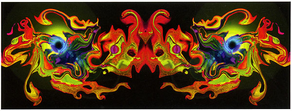
 Photo: from Photo Synthesis by Grant Sheehan Digital art slash photography - originally published on PhotographyMatters.com, April 2008. In 1998, ten years ago to the month, I purchased an off-the-shelf computer and Photoshop 4.0. Prior to that, if you wanted to do anything much with digital photography it was an expensive exercise, more the realm of professionals. Also at that time, for around a grand you could buy an amateur digital camera with about a megapixel of image resolution; useful for postcard-size prints. So let’s call this the tenth anniversary of digital photography for the masses. Surprising, then, how relatively little serious art has been made using digital cameras and Photoshop in the last ten years. I’m talking about going beyond what was possible pre-digital; sure, anyone can take a picture and muck around with the various filters, a thing we’ve all done for fun. (The pre-digital equivalent was Cokin effects filters, something real photographers would never resort to.) But how often have you seen really interesting photography that utilises the possibility and control these now ubiquitous tools offer? I recall one show at the Sarjeant Gallery, Wanganui, by Anthony Goicolea (thanks Microphen). He photographed himself to create casts of dozens in metres-long tableaux, to great effect. At Photospace gallery, I have shown Siren Deluxe’s A Gender series; male and female nudes skilfully blended into hermaphrodites, photographed in domestic interiors; also Yvonne Westra’s Staged; black & white pigment prints of multiple photographs crafted into surrealistic, dreamlike scenarios. Steven McNichol’s Joel-Peter Witkin-inspired horrors used Photoshop to blend layers of man and beast, extending the subtlety and possibilities of his already considerable darkroom technique. Two exhibitions in Wellington, one by Grant Sheehan at Bowen Galleries and the other by Brian Fernandes at Thistle Hall Gallery, feature works that began their lives as photographs of things or people and ended up as something quite different. In viewing both of these exhibitions, I asked myself the same question: why even start out with a photograph? In Grant Sheehan’s case, it seems natural. We know his photographs from numerous published books, most of which explore and record architecture and the urban landscape. Think cafés of NZ and the world, Wellington by evening light, historic lighthouses, etc. (And he has just won Cathay Pacific Travel Photographer of the Year – congratulations Grant.) So, after several decades of straight photography, I applaud him for moving out of his comfort zone and creating something completely different and unexpected. The digital images, printed to a medium size on metallic photo paper and pinned to the gallery wall, look like a trip back into 70s psychedelia. I can imagine Sheehan spending long hours glued to his computer with Hendrix, Cream and The Doors coming off vinyl at high volume for inspiration. I’m sure that if you spend the time looking into these artworks you’ll see all kinds of stuff, (like in the Camel cigarette packet illustration) but they’re not for me, personally. While Sheehan used Photoshop’s facility for building and blending multiple image layers, Canadian artist Brian Fernandes used a computer algorithm of his own design. His digital artworks have titles like Thinking Man and Man and woman reclining; and one wonders how the images, which look like glowing spheres hovering in deep, black space, were ever human figures. Someone asked me, ‘What is it, a close-up of a nipple?’ In fact, the various coloured pixels that once formed a completely coherent image of a nude man, woman or couple photographed against a black background, were systematically rearranged according to the artist’s mathematical formula, number-crunched into something else entirely; the said floating sphere-like form. And they are beautiful things. After seeing the works at Thistle Hall, I asked Brian if he’d like to show them at Photospace for a while, so the four large pieces are now hanging in the studio lounge area. Come and have a gander, see what you think. (Brian’s statement about his process, I posted here.)  Photo: from Pixel Nudes series by Brian Fernandes You’re waiting for me to ask this question, yes: is it photography? Well, I’m not asking it. (No, I just did, didn’t I.) What I mean is I’m not that interested in the answer. Does it matter what they are? Does it matter whether the viewer can visually perceive the photographic origin of the images? Do we need to categorise? I guess that if there wasn’t a photograph in there somewhere, then I wouldn’t be blogging about the things. You can create your own pixels in a few keystrokes, but you need some variation, some texture or line or shape to get a hold of before you can really start to play about. You need some origin. A photograph of something—anything—is an easy place to start from. You don’t even need to take your own. Brian Fernandes looks to have gone to some trouble to take his nudes, thus gaining true ownership of the images and their titles, but he could’ve just as easily started from a downloaded snap of Paris Hilton. What Grant Sheehan’s images started off as, only he knows. A café? A lighthouse? I’m still figuring this out, thinking as I write, (you can tell?), and I guess I’m neutral here. Every image we see is manipulated to some degree; by the mind and attitude of its author, editor, or the political stance of the publication or context in which it appears; and particularly these days because, at some stage before we see it, it’ll be a bunch of pixels on some person’s computer screen. So why not go the full monty and take that manipulation to the nth degree, make something that is unrecognisable as its original form? OK, so it’s not photography. So what? Sorry it’s been a while since my last rant. I was busy getting married and stuff. by james | 21 April, 2008 Comments below.
0 Comments
World Pinhole Day 2008 - originally published on PhotographyMatters.com, April 2008
Each year since 2001 the last Sunday in April has been designated World Pinhole Day. The website www.pinholeday.org is the place to go. The rules are simple: submit one lensless photograph per person, taken on the Sunday. There has been a workshop run at Photospace every year of WPHD, the first one run by Eddie Shaw, then Mark Marriott and I took over when Eddie moved back to England. Being in New Zealand, we get the jump on the rest of the world timezone-wise, usually getting the first photos on the exhibition site. This year is no exception. I can’t help wondering if the wonderful, dedicated people who run this website/event are getting a tiny bit sick of us. “[Groan] Oh Christ, not those guys again.” Anyway, the whole pleasure of partaking is in creating a photograph with a camera you’ve made yourself (we use Pringles cartons, the small ones) and developed in the darkroom. The first time I experienced this myself, in 2001, coincided with the arrival of a new digital camera (the second one - the first having been pressed into service in 1999) for the photography business and trying to figure out how to run the thing. Making a camera out of a Planters cashew nut tin and getting a perfectly sharp, well-exposed and still interesting photo out of it was a real buzz, and in complete contrast to wrestling with the new digi. The technology employed is 19th century (well, mid-20th, since we use resin-coated silver-gelatin paper for a negative) and the thinking much older. The camera obscura (described in the 5th century) vastly predates the photographic negative (William Henry Fox Talbot, 1830s) and the observation of light coming through a small hole into a dark room (or cave!) and creating a projected image of outdoors, reversed and inverted, is probably prehistoric. The pleasure of doing something with photography that is hands on is, for me, greater than using a computer-driven hunk of plastic that is today’s digital camera, moving the image into a computer (more plastic) and then to a website. The digital image often never hits the ground; that is, it never has a material existence, so there doesn’t tend to be the associated strong feeling of having created something oneself; technology dilutes this feeling, perhaps because so much of the work has been done by others. I guess I sound a bit old school here, but most people who do our workshops have never done anything except digital photography, and they get a huge buzz out of making the camera, discovering the characteristics of it and developing their own images in chemicals. The most common feedback is, ‘You wouldn’t believe you could take a photo with something as simple as this.’ Obviously there has to be some restriction on the size of the images stored on the www.pinholeday.org 2008 gallery pages, so you can’t really see the detail recorded. For example, in Bethany Campbell’s image (#5 ) the writing on the Sweet Mothers Kitchen sign is clearly readable in the original print. And there are some fine photos taken using a pinhole on the front of a digital camera, but really… it’s cheating. by james | 27 April, 2008 Reading Photographs, Part I - originally published in PhotographyMatters.com, May 2008 How long does it take to read a page of a novel? A minute or two? An average length poem? Somewhat longer, and you’ll probably reread it. A photo? What about 1.5 seconds? Because, in my observation, that’s about how long many people spend looking at a photo. In a newspaper maybe? Yeah, but also in an art gallery. And I’m not specifically referring to Photospace gallery here; this observation has been made across a heap other photographic exhibitions in numerous galleries. An example; while at the Magnum Photo exhibition at Te Papa a few years ago, I observed many visitors’ eyes flick from photo to catalogue to next photo, mentally ticking off images as fast as they could: seen that one, seen that one…. This is a justifiable approach when confronted with an exhibition comprising several hundred photographs. I decided to tackle that show by spending my time looking closely at a much smaller selection of photos, knowing I couldn’t take in the whole thing. It worked, but I missed a lot too. (Buy the book and browse at leisure?) We encounter too many photographs these days, in newspapers, magazines and on the internet and television, so it is sensible to ration our time spent looking at each one. Trouble is, this conditioning stays with us in the art gallery; we could try to leave it at the gallery door. Our larger institutional galleries have sometimes made this difficult, as above, by presenting exhibitions of too many works. It’s often about scale equalling importance. The Slow Food movement, most people are aware, is in part a reaction to fast food. The idea is not that the food should take a long time to prepare, but that we slow down the pace of our busy life long enough to enjoy the meal, and in doing so benefit from the other things around that; the social aspects as well as the food itself, and the break from whatever else we’re doing. And it carries with it the concept of respect: for the food, the provider, the company and enjoyment of life in general. Think of this next time you encounter a photograph or exhibition of interest. Just make the time; it’s a creative act. A 2003 exhibition at Victoria University’s Adam Gallery, Slow Release, featured some of the usual suspects; Peter Peryer, Anne Noble, Ann Shelton Fiona Pardington, Gavin Hipkins, and a couple of newbies (at the time); Fiona Amundsen and Yvonne Todd. ‘As a collective group, the works promise to hold the viewer in the act of looking and to reward with meaning.’ To live up to this claim in its publicity material, Slow Release was going to have to deliver a bunch of pretty damn good works. And, I’m happy to say, it did. (You thought I was going to rip into it, yes?) Liked the show, liked the works (mostly) and, more to the point, I liked the title. I took it with me to carry about for when I need to slow down to get the most out of some other exhibition. The point is that most photos that are worth spending your time with simply are not intended to impart their meaning, their content, their beauty, their poetry to you in 1.5 seconds, unless you’re Mr Spock of the starship Enterprise. Press photographers often shoot for impact and fast delivery, and fair enough, because it helps sell newspapers; but exhibiting photographers don’t always go for impact. Or if they do, there’s usually something more going on once the impact wears off, because it is a temporary quality. (Think of Christine Webster’s Black Carnival for impact, or Yvonne Todd’s series of beauticians in Slow Release.) The artists spend a lot of time, energy and resources to put the work in front of you, and so does the gallery; and that deserves the respect of the viewer. Yet I’ve often seen gallery visitors skim around a roomful of photos in less time than it took them to get from outside into the room. I wonder why they even bother. So they can tell their friends they saw the show? This is intended as the first in a series of posts on Reading Photographs, and its message is simple: slow down and really look. Take your time and the photographs will begin to reward you. Apologies for the somewhat lecturing tone. I’ll back off it a little in Part II, if you’re still reading. ‘… to reward with meaning.’ I need to get into that last word. Photography is a kind of language, right? A photo can be likened to a poem, and most poets don’t just string words together because they like the sounds they make. Sure, that’s part of it, but poems have meaning, even if it differs for each reader. Photographs have meaning too; so how do we begin to extract it? Next time…, and the time after that…. by james | 1 May, 2008 6 Responses to “Reading Photographs, Part I”
(Links removed from below, as they are mostly no longer live.)
|
AuthorPhotography Matters II Categories |
 RSS Feed
